Picheloup Place Renovation
New Orleans, Louisiana
A neglected New Orleans bungalow was reimagined as a serene retirement retreat, complete with modern amenities and tailored for two couples’ individual tastes.
Photos: Laura Steffan
AFTER: Street-facing facade with reconstructed porches on both floors. Bungalows often used smaller exposure siding on the front with mitered corners at porch details.
The families opted to maintain this split arrangement, with the paramount objective of creating a shared home where they could spend more time with their children and grandchildren while leaving the burden of a large house.
In early 2021, amidst the COVID pandemic, two couples approached our design team with a unique project. A brother and sister, along with their respective spouses, sought to embrace a new chapter in their lives by downsizing and relocating closer to their children and grandchildren. The dwelling they had acquired was a 1920s bungalow-style two-family residence, albeit burdened with dated finishes and an impractical layout.
Divided into upper and lower units, the families opted to maintain this split arrangement, with the paramount objective of creating a shared home where they could spend time with their children and grandchildren while leaving the burden of a large home. The design team incorporated an elevator and adaptable, accessible bathroom layouts. For convenience and safety, a rear addition included secured covered parking and a new connecting exterior stairway.
Design for Well-being
To optimize the living spaces and capitalize on the picturesque surroundings, particularly the sprawling side yard adorned with a majestic oak tree, the design team proposed a significant alteration. They flipped the existing public-private zones from north-east to south-west, allowing the public areas to bask in the warm, filtered light from the grand oak, promising to infuse the interior with an inviting ambiance.
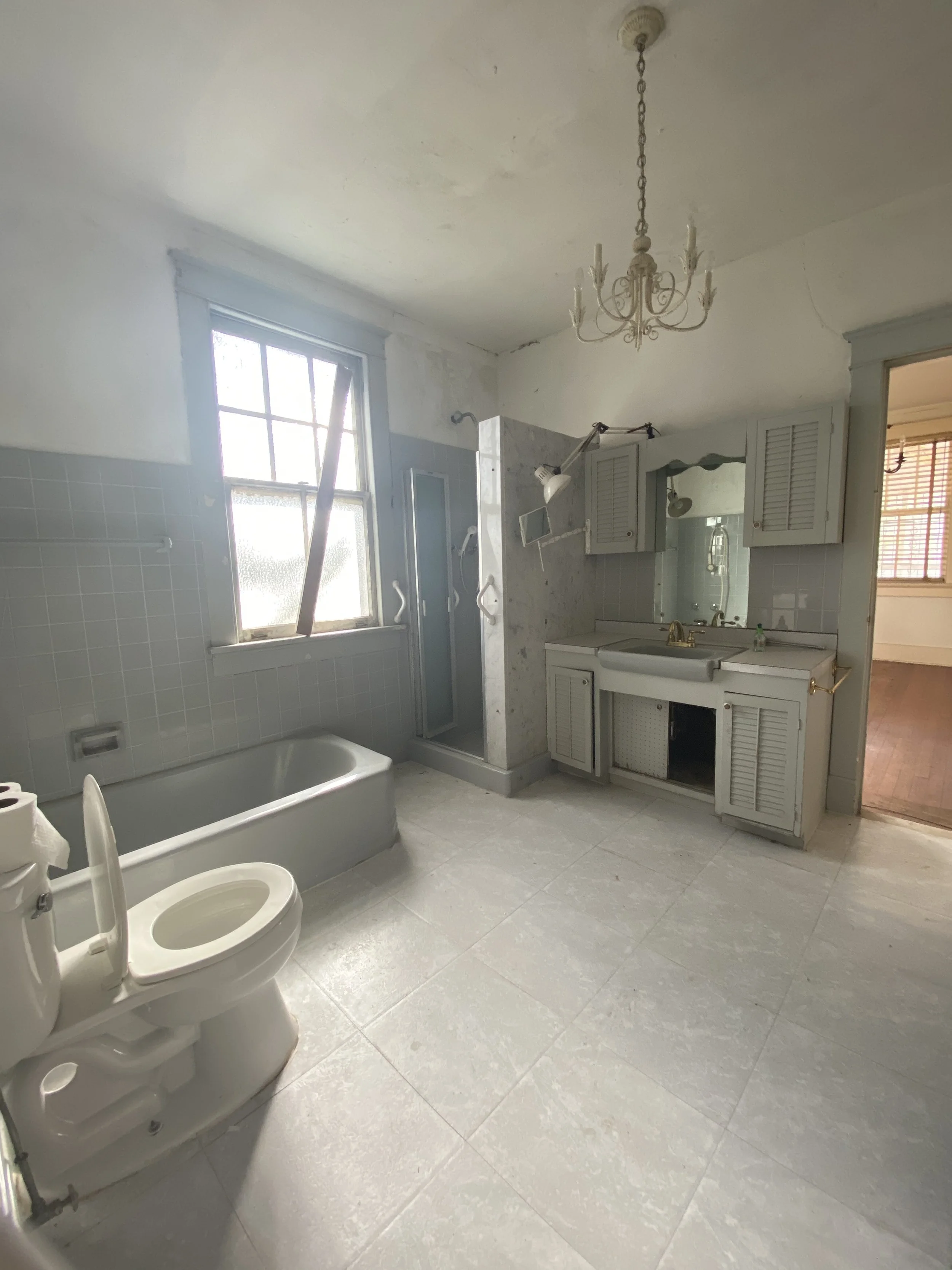
However, capturing the transformation in 'after' photographs posed a challenge. In reversing the floor plan, maintaining consistency in perspective between the before and after images proved tricky, given the dramatic overhaul of the space.
First Floor Residence
The first floor aesthetic is inspired by the 1920s period, with a modern color palette incorporating craftsman style detailing. The interior features extensive wood paneling, ceilings adorned with wood finishes and trim, and custom wood cabinetry. Preserving the authenticity of the space, original pine floorings were retained, with necessary restoration in certain areas where tile was used as flooring.
Thinking Smarter About Space
This three-bedroom, two-bathroom residence also boasts a compact office space. Notably, the grandkids' bedroom conceals a surprising Murphy bed, a delightful novelty for guests. A walk-through butler’s pantry leads to the laundry room, which then provides a rear entrance to the primary closet and en suite, allowing for flexible circulation.
A key feature of the renovated layout is the seamless integration of spaces for family gatherings. The kitchen and living room are now visually connected, fostering an open atmosphere conducive to entertaining. Conversely, the dining room is discretely partitioned off by a thickened wall and two cased openings, offering a balance between connectedness and privacy.
Second Floor Residence
Situated 18’-0” above grade, the second floor residence takes a much more contemporary turn. This two-bedroom, two-bathroom apartment embodies a sleek and minimalist aesthetic, distinguishing it from the residence below.
To comply with building codes requiring a one-hour floor separation between units, the original pine flooring was replaced with a fire-resistant homasote panel, and new elegant white oak was laid over a plywood subfloor. The removed pine flooring was utilized as filler material for the original floors to remain downstairs.
Maximizing Space
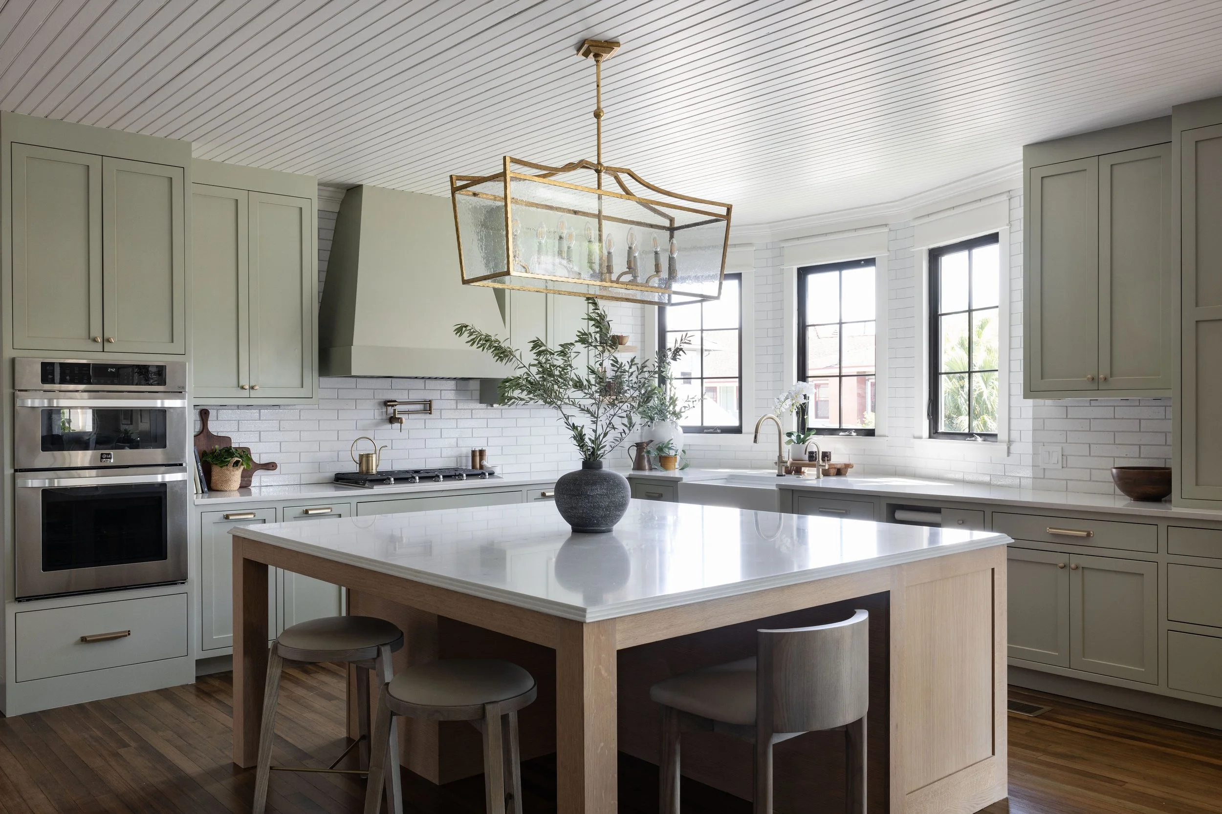
Innovative design choices define the kitchen, which eschews upper cabinets for a more open and spacious feel. Despite this minimalist approach, the kitchen offers abundant storage solutions, including clever inserts such as pegged drawers for dish storage, a flip-open sponge holder at the sink, pop-up outlets, and a full-height pantry cabinet along the refrigerator wall.
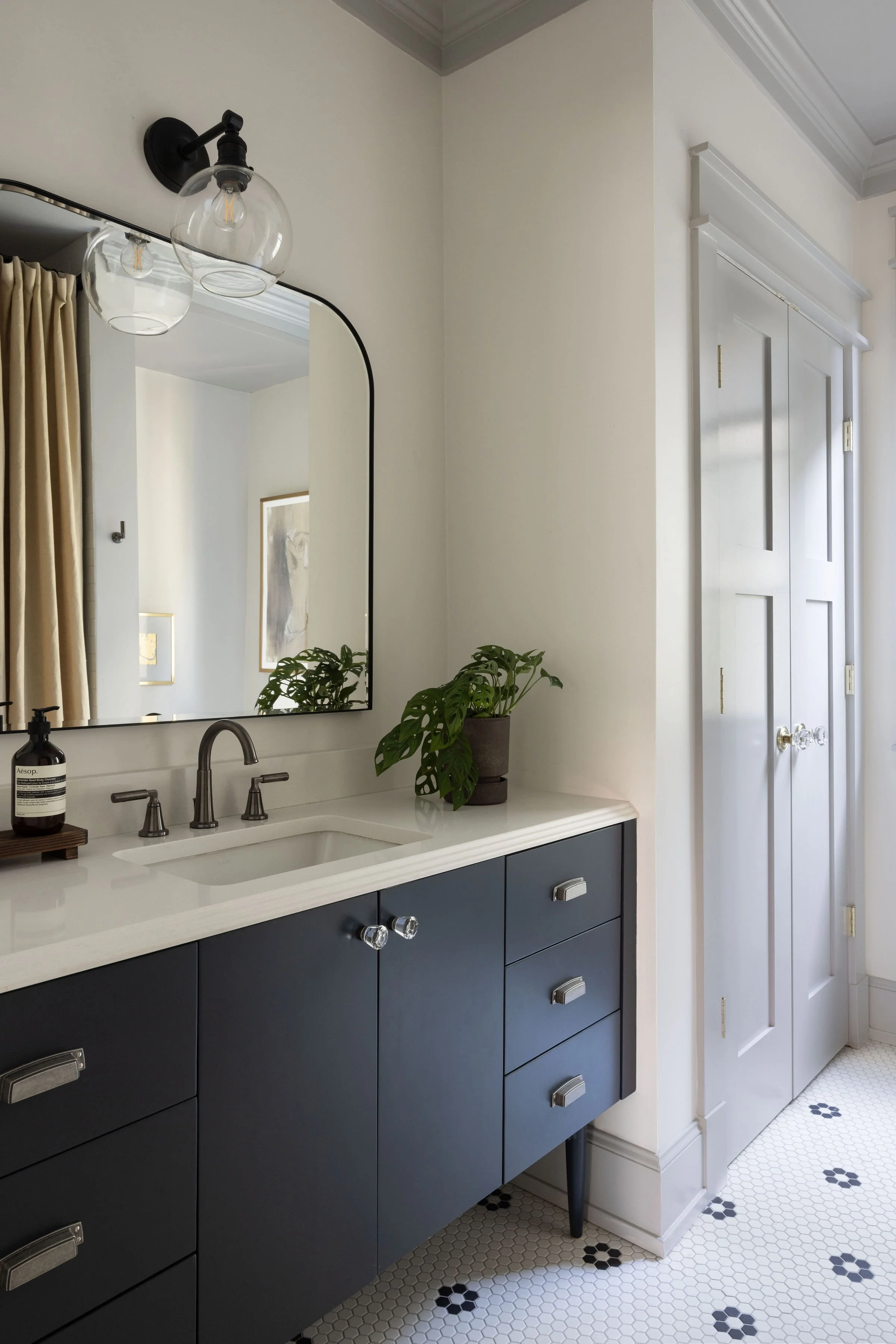
The primary bathroom epitomizes integration and functionality, featuring a mirrored TV seamlessly embedded within the mirrored vanity wall. Additionally, toe-kick heaters discreetly installed beneath the wall-hung wood vanity ensure comfort without compromising the aesthetic appeal of the space. This harmonious blend of design and practicality underscores the commitment to contemporary living.
Project Data
Neighborhood: Parkview, Mid-City, New Orleans, LA
Square Footage
Lot Area: 10,480
Total Conditioned Area: 5,068
First Floor Residence: 2,830
Second Floor Residence: 2,238
Approximate Construction Costs: $276/square foot
Key Architectural Elements
Elevator: Savaria
Wood Flooring (new): Vision Wood
Countertops: Daltile, Caesarstone
Porch Carpentry: Aeratis
Tile: Cle’, Daltile, Karen Pearse Global Direct
Plumbing Fixtures: Delta
Paint Colors (Exterior)
Siding: Benjamin Moore Indian White, OC-88
Trim, Columns, Railings: Benjamin Moore Mayonnaise, OC-85
Door Panels: Farrow & Ball (Match) Parma Gray 27, Farrow & Ball (Match) Charleston Gray 243
Paint Colors (First Floor Interior)
Walls, Trim and Ceilings Throughout: Benjamin Moore White Dove OC-17
Kitchen Cabinets: Farrow & Ball (Match) Blue Gray
Guest Bath Ceiling: Farrow & Ball (Match) Pavilion Gray 242
Paint Colors (Second Floor Interior)
Walls, Trim and Ceilings Throughout: Benjamin Moore White Dove OC-17
Kitchen Cabinets: Farrow & Ball (Match) Mizzle
Kitchen Limewash: Color Atelier Fumee


