Garden District Residence
New Orleans, Louisiana
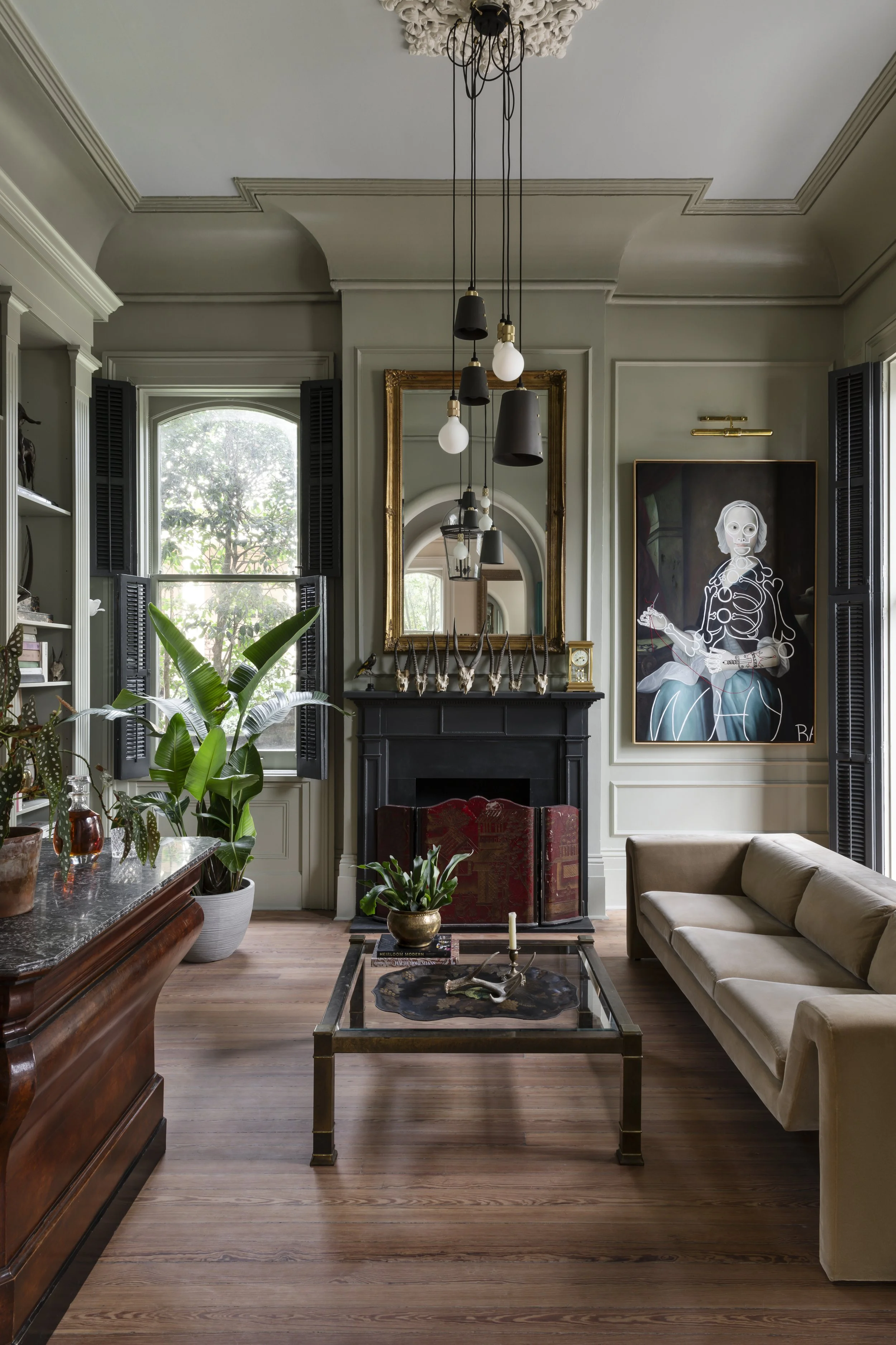
A stately Victorian home in the Garden District undergoes a transformation reversing a dated renovation with stylish upgrades including fixtures from England.
Photography by: Jacqueline Marque
At the soul of this renovation project is a building in need of repair due to damages by Hurricane Ida, an inefficient chopped-up layout and neglect from prior owners.
Upon entering the home, you were abruptly welcomed by a wooden switchback staircase, leaving minimal room for reception and cutting the living room off entirely from the rest of the house.
Better Circulation
The design team proposed removing the existing non-original staircase and installing a straight stair extending to the rear, pushing it slightly back to open the living room up to the grand foyer space and dining room with two plaster archways.
To add more to the space, the entire center hall on the second floor now opens from front to back allowing sunlight to penetrate deep into the center hall, linking both stairs.
Before
After
Connection to the Past
Before the renovation, the second floor center hall was occupied by numerous interior closets with low ceilings. The design team proposed restoring the center hall allowing for better circulation and spatial clarity.
The original pine floors were retained, sanded and coated with a water-based sealer. Panel moldings were applied to the walls.
Historic plaster crown molding all along the center hall was restored, with existing remaining pieces incorporated into the work.
A Kitchen For Gathering
The kitchen area was expanded from the original footprint to capture a small sitting area adjacent to the main kitchen area.
Appliances and utility spaces were hidden through the use of panel-ready products and a hidden doors adorned with panel molding.
Integrated brass furniture outlets on the island allow for easy charging that’s not visually jarring.
Better Left Untouched
A single plaster wall was left untouched to retain a connection to the past. The striking pink hue pairs well with the neutral kitchen. Many of the plumbing fixtures and decorative light fixtures were sourced from England. Copper planters were custom fabricated and integrated into the windowsills for herbs.
Sensory Encounters
The primary bathroom prior to the renovation was an empty shell of a space with a freestanding tub and toilet next to the existing fireplace, a holdover from the former smaller multifamily layout.
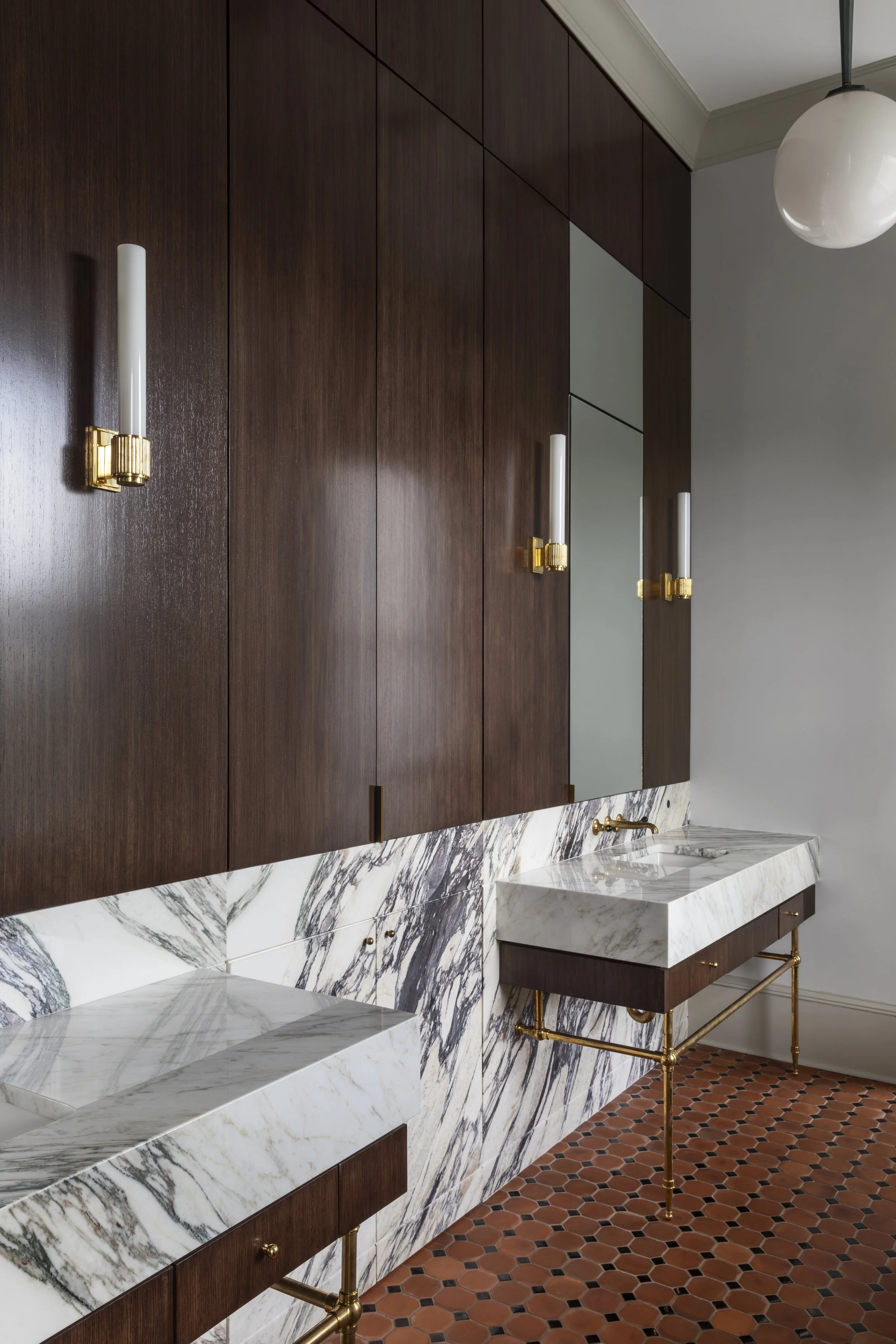
The new design extends through a functional linear space with lots of natural light, featuring a steam room and shower with a custom steel enclosure, radiant heated flooring, concealed medicine cabinets, and integrated storage.
A Playful Palette
The nursery bedroom and bathroom were designed to integrate a floor to ceiling wardrobe and changing station, later to be converted into a desk area.
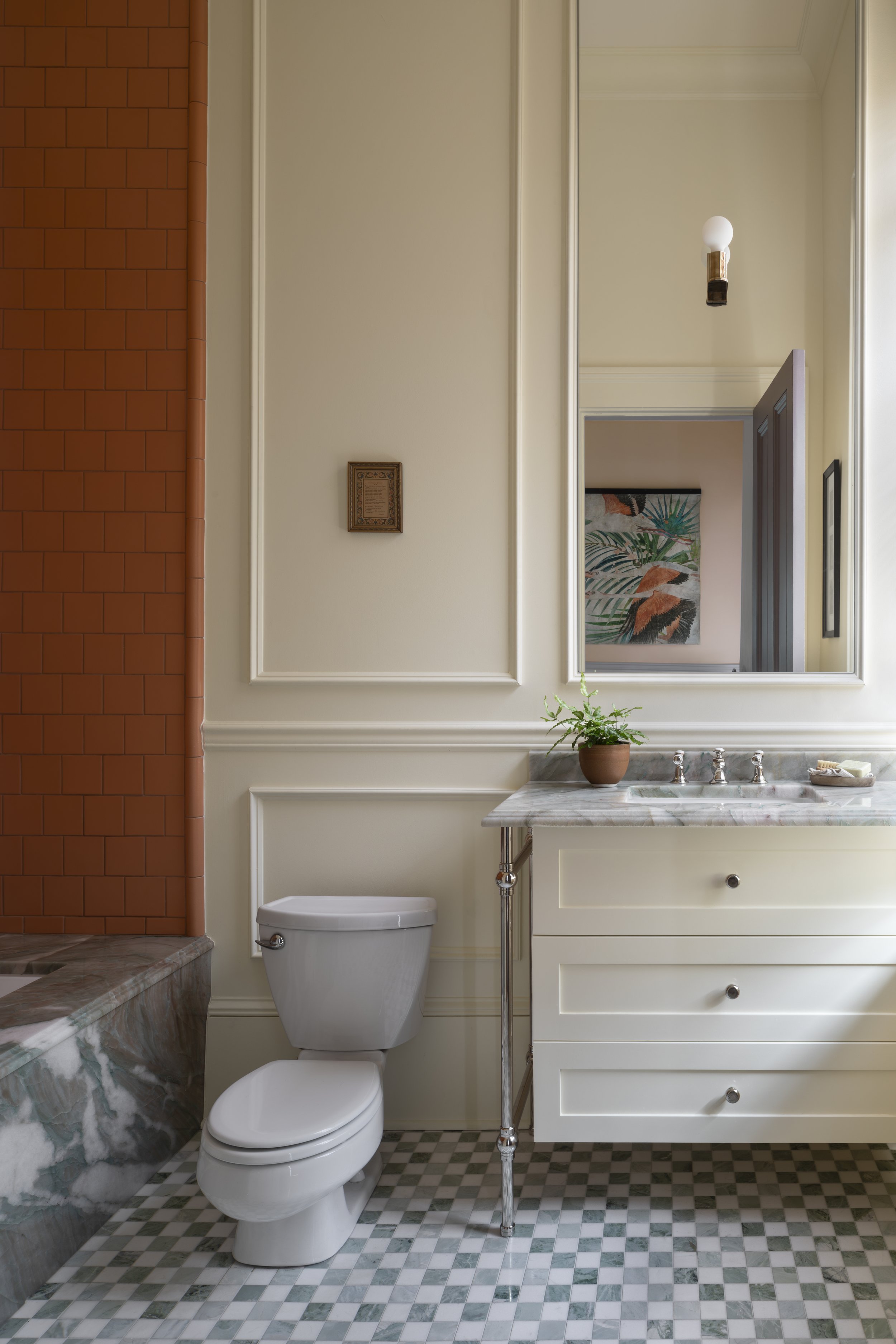
The bathroom incorporates a custom vanity with matching marble surfaces. The kiddie toilet was a functional touch that will simply be swapped out later for a standard size toilet.


