Lizardi Town Homes: a Perspective from the Architects
I wanted to blog about our latest completed project: the Lizardi Town Homes, as an opportunity to showcase some of our beautiful before-and-after photographs, but there is so much to cover, or uncover rather, with this project. Everything from the history of the building, to the owner’s discovery of the space, to our strategy in telling it's story through architecture.
Corner of Prytania and Terpsicore - BEFORE
Corner of Prytania and Terpsicore - AFTER
Growing up in New Orleans, I have always had an appreciation for the historic building stock, the layers of history and how each generation adapts these buildings to their interpretation of "modern".
The Lizardi Town Homes were built around 1836. Historians discovered that like many of the homes along the Mississippi River in New Orleans, the property was once a part of a larger plantation or estate. Eventually parceled off because of the economical pressures of downtown expansion and farming opportunities in more rural settings.
Sanborn Map showing the Lizardi Trio Town Houses
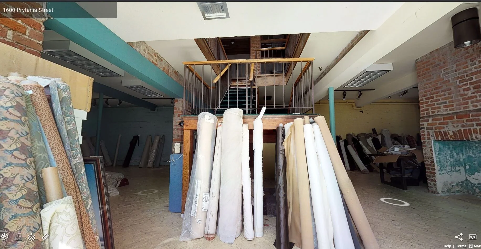
The original structures, three total at their conception, were built for the Lizardi Brothers, who were Mexican trade merchants using New Orleans as their pit stop while traveling back and forth from Mexico to Europe. Henry Laurence bought the property in 1847 and kept the property the longest until around 1970 when the property was purchased by a furniture retailer/fabricator. At this point in history, the buildings were modified into a large, single-occupancy space. At some point in history, the smallest building of the trio was demolished and the vacant lot used for parking.
The buildings’ newest owner is our client, Developer Montgomery Berman and Co.. He discovered the town homes in their most “modern" configuration with an atrium in the back. This atrium connected the once "service wings" of the main structures with a stylized, wood-and-glass curtain wall.
Walking through the building for the first time, we could see that this addition may have be installed around the 1970’s or 1980’s, when the furniture store was expanding their showroom and offices. The wood windows lacked proper flashing and were beginning to rot, and the minimal amount of new finishes applied to the atrium space were dated and lackluster. Original brick paving at the ground level remained, but was painted to match the walls.
BEFORE: our client found the buildings with a two-story stair atrium enclosed with a stylized, wood-and-glass curtain wall.
BEFORE: interior views of the atrium space that was added around the 1970s or 1980s.
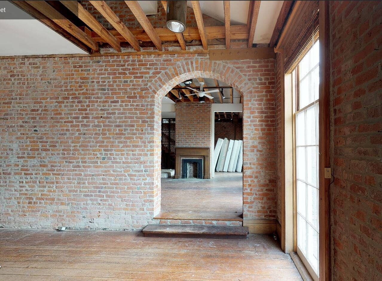
The main structures, now connected through brick archways, were stripped down, bare and dark. Instantly, I could visualize the Lizardi or Laurence family enjoying these rooms with their large, double-hung windows and wrap around balconies. I could see hoop-skirts, gas lanterns, and depression china. I could hear piano melodies and brass ensembles. One of the original stairs was still there, the heart pine winders and iron railing were a tactile glimpse into the past.
BEFORE: connected main structures
AFTER: bedroom space for one of the apartments
Our Design Strategy
With the developers approval, we proposed removing the 1970’s additions. The atrium enclosure was hiding the historic service wings. Below the service wings' balconies, we didn’t simply fill the large openings on the first floor with stucco-clad wall to match, but rather diagonal cedar planks as a gesture to the story of its modified past.
BEFORE: atrium addition circa 1970
AFTER: courtyard between original service wings
Although the original kitchens and washrooms would have been on the first floor in the service wings, our new program called for kitchen and bathrooms in the main structures. The buildings' new program required more tenant occupancy, thus resulting in four kitchens total instead of two.
One of the design strategies we used called for was modern delineation: sharp, white lines against antique brick walls. This contrast highlighted what is new and what is old. Smooth sheetrock walls abutting rough brick walls can create odd details so we painted the return side of sheetrock bead black, so that the planes appeared flush and intentional.
Original Wood lintels and transoms above historic openings were retained and repaired.
The only original door found on the property was used as a basis of design for many new doors.
Fresh coats of paint on the exterior stucco facade and gas lanterns dotting the entrances enliven the buildings' street presence. The modern railing in the courtyard was an intentional choice due to the fact that original service wing railings were shorter with balustrades further spaced apart. Fabricating these railings back to historic proportions would have been a safety concern and code issue. Instead of designing a traditional wood railing, we chose to use cable rail. Cable rail allows views to penetrate further and focus on the architecture instead of tightly space white balustrades creating visual clutter.
We chose colorful cabinets and brass accents in the kitchens. The bold colors nodding to the colorful timeline of the buildings’ history and brass complimenting the warm of the space. We tried to minimize exposed electrical conduit were we could. With exposed brick walls everywhere, we had to run electrical wires in the baseboards, so that silvery conduits were not popping up like gophers along the historic walls.
Corner Apartment - BEFORE
Corner Apartment - AFTER
With over 1,000 unique conditions, this project, for us, required constant eyes in the field. That is the difference between restoration and renovation; the difference between preservation and remodeling. What remained, untouched and creating character in the space, was left alone. What we could build back, windows and doors in particular, we did to the proportions of the original structure. We let history inform the product, in this case. We used our filter to create the story.
Project Team: Developer: Montgomery Berman & Co., Architects: Studio BKA, LLC, Contractor: NFT Group


