Schematic Design Strategies for Historic Properties
Developing a design strategy for historic properties can be challenging especially when you are nostalgic like myself. Often, our clients desire to alter the home to adapt to their families’ needs and wants can be at odds with our internal values and priorities of keeping intact the fundamental historical bones.
Any historic building, residential or commercial, can be perceived as characters frozen in time, but realistically, they need to grow and adapt to remain relevant. As fun as it may be to picture, it’s unrealistic to expect everyone who owns a historic property to adapt their lifestyles to the building, horse and buggy, hoopskirts and all. It’s a balancing act to make these buildings continue to work, while avoiding modification beyond recognition.
In today’s blog post, I am sharing how we develop early plan options and massing model options for our clients who task us with the responsibility as their architects.
Part 0: Gathering Information
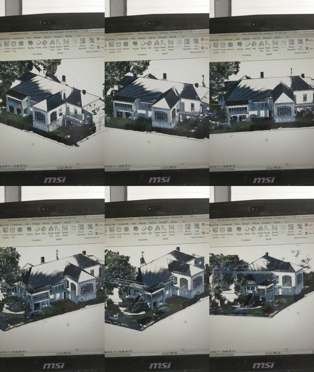
Prior to putting pen to paper, we study the property. For this specific property, I took over 300 photos, and we used a 3D scanner to create a point cloud of the complex exterior of the building for our virtual model. We also look at the history, using historic records to determine the original form and use of all the wings and facades. It’s important to build from a good foundation of information.
Part 1: Schematic Plans
Pedestrian Arrival vs. Vehicular Arrival
There are many ways we arrive in our home. The entry, and how we arrive at that entry, are very important. The arrival sets the tone for the experiential qualities of the home, and is a statement of the owners’ values. In this Queen Anne Victorian home, we honored the formal entry, centering the stairs with the front door. The formal front foyer space, with its classical proportions, remains as found, serving as an anchor between past and present visitors’ experiences.
Depending on the context of the neighborhood, the vehicular entry may have a designated and possibly covered path to a secondary entry. The secondary entry may be more casual than the formal entry. Upon entering a secondary entry, there may be a “dump zone” where you can throw your bag, keys, shoes or other personal items. In formal entries, this may be a console table or bench. Sometimes, the two entries are a combined adaptation of both formal and secondary.
In this example, we are showing a secondary arrival point at the rear of the home, beyond the point which a car may be parked. This secondary entrance has close adjacency to the kitchen.
Private and Public Zones
We look at any house as having two zones: public vs. private, or, put another way, quiet vs. active. In this home, we studied the arrival, drew a line indicating the circulation or flow and then bubbled areas of quiet and areas of activity.
Note: When creating the circulation of a home, it’s best to keep things as simple and clear as possible, getting too complex can create meaningless halls with dead ends.
option 1 - showing private zones in mint
option 2 - showing private zones in mint
Here, we know in both schemes the formal living, dining and family rooms want to be on the right side of the home, proceeding one after the other in a typical Victorian home fashion, leaving the left side of the home for bedrooms or privacy.
In addition to a bedroom zone, some homes will further separate a master bedroom from kids or secondary/guest bedrooms. It’s always good practice to create a physical barrier between the master bedroom and the kids bedrooms with a closet or bathroom.
We studied two different privacy zones: first option showing all the bedrooms banked together and the second option showing the master bedroom in the rear of the home.
The Heart of the Home
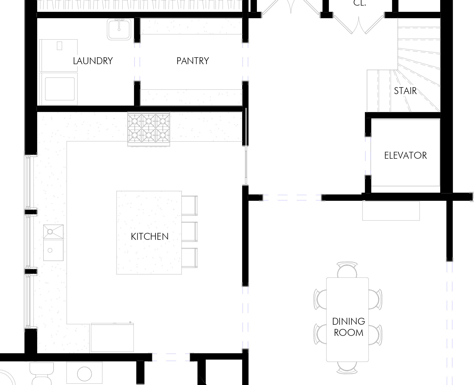
The kitchen may have not always been the heart of the home in the upscale houses of old, but in the modern era, we spend more time in the kitchen than any other room (with exception of our bedroom), therefore, kitchen adjacencies are important. We need a pantry storage and laundry to be accessible from the kitchen while being visibly connected with the entry, dining room and family room.
In this home, we studied two placements of the kitchen. One option showing a large kitchen with a center island. The other option illustrating a long “galley” style kitchen.
option 1 - square kitchen configuration
option 2 - galley kitchen configuration
Here’s my issue with the galley kitchen. Don’t get me wrong, I love a nicely designed galley kitchen, but as someone who spends lots of time cooking, I really like having countertop space close to my refrigerator, sink and stove. The galley kitchen’s long countertops mean that as I am preparing food, I have to move farther to find more countertop space along the walls. Square kitchens with islands have more efficient triangles of operation, requiring less searching for space when preparing food. Take a look at the two options we presented above. I think they are both nice, but, personally, I would prefer the square/island kitchen in my home.
We always give our clients more than one option when thinking about how they want to live in their home. We study the owner’s goals, program and priorities and look to see if there are alternative means of achieve the same results without disturbing as much as the historic charm of the building.
Part 2: Massing Studies
In New Orleans, we have over 20 nationally-registered historic districts and 19 local historic districts. Any effort developing concepts in the planning phase needs to address the historic context of the neighborhood. The façade of the home does not only belong to the owner but it belongs to the city, to the neighborhood, and to the lovers of historic architecture who come from all over the world to New Orleans.
Identifying the Style of the Home
We observed that this Queen Anne home was modified probably around 1930-1940 when the Arts & Crafts movement was having a moment, so our massing design concepts attempt to refer to the home’s original Queen Anne period (1880-1910).
This particular example of the Queen Anne is a one-story home or sometimes referenced as a Queen Anne Farm Home. New Orleans is hardly a farm anymore.
What this Queen Anne Structure may have originally looked like in 1910.
Quick Model Studies
We developed several options when looking at modifications to the exterior of this classic home, addressing the owner’s concern with the entry porch feeling too low and dark.
Pick your moves wisely. Too many sweeping changes to the character of the house and will have less of a chance of success.
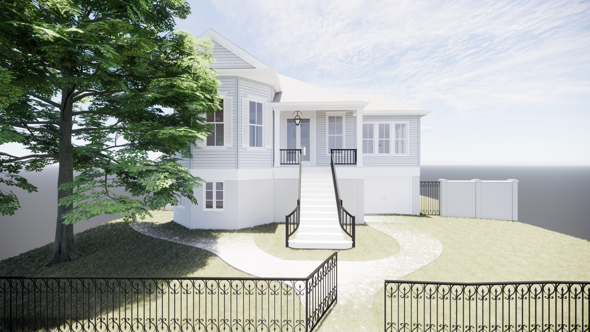
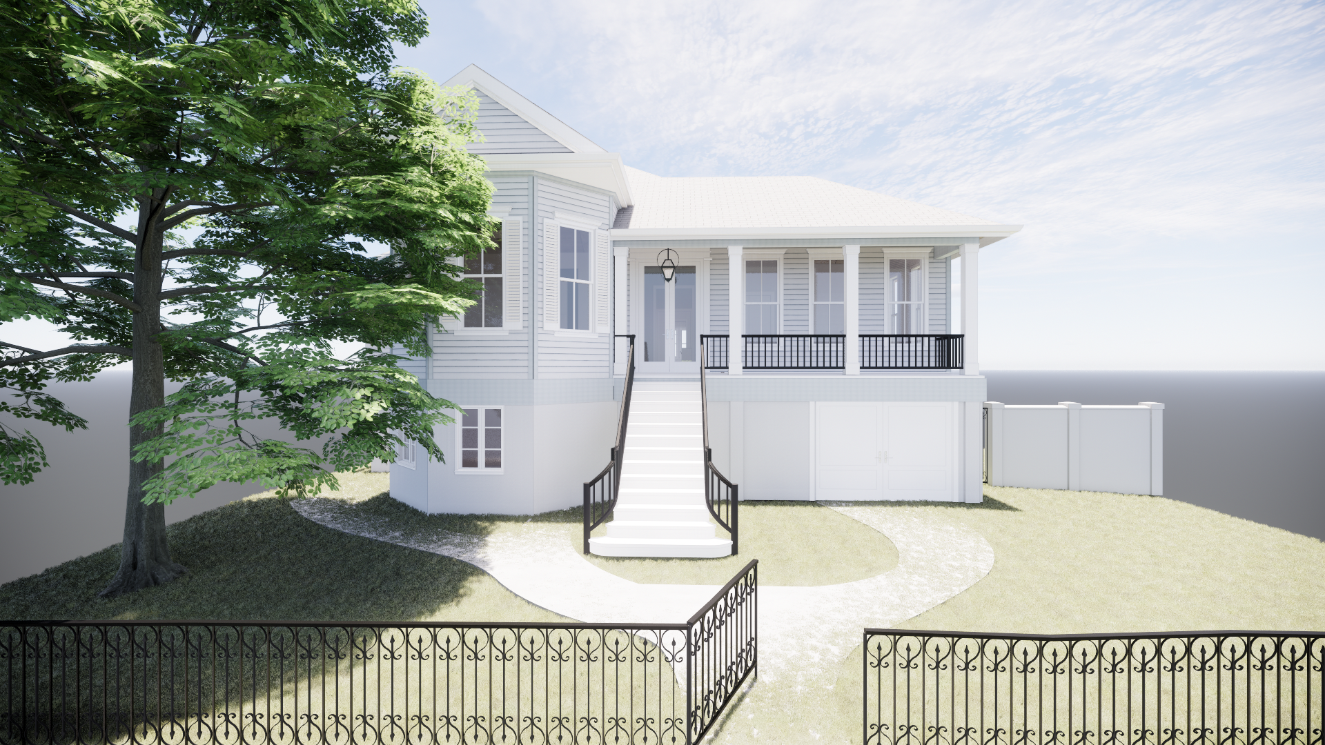

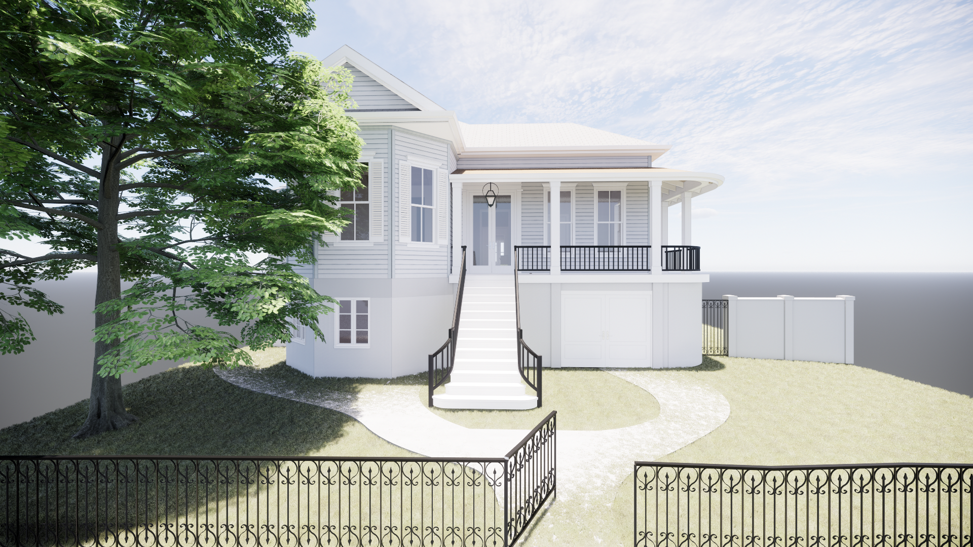
We still have many iterations to develop, including window styles and dimensions, door panels and dimensions, stair and porch railing design, and columns as well as other architectural trim detailing before we put a pin in anything. And of course, the final design will need to be approved by the historic district staff and committee members. Stay tuned as we develop the design of this beautiful historic structure further.

